Layout Design
Editorial design is something I am not very familiar with so I decided to research it in quite some depth as I felt like I literally had no where to start. Although after researching it became apparent

I noticed that most of them used a column grid system to type set all the content. They also used black and white imagery along with triangles and images that fall outside of one page.

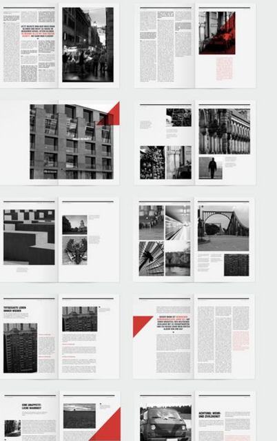
I decided to use some of these elements in order to make my layouts follow a structure and look more professional. I also wanted them to be simplistic and easy to read, so I did add any page numbers to avoid confusion and also due to there only being a few pages I didn't feel this was as necessary. I also didn't add a contents page or a glossary for the same reason.

I started by creating a 2 column per page grid system and type set the information onto the page onto one of the column. I then edited my image making it fit into the column system and I used the gamut warning feature in photoshop to ensure that my image was ready to print and looked exactly how it should on screen. From RGB to CMYK. I then zoomed in onto the A in the photo that I wanted to make apparent and made a vector in photoshop. I placed this against a dark blue background to fit in with similar colours used in the photograph. I then decided this was a theme that I would use throughout my book.

I used the 2 column grid system throughout all my layouts to keep it consistent. Here I placed a opaque green triangle across the page in contrast to the black and white image behind to make it more visually appealing and interesting. I also researched the co-op throughly and I found out that it is a well established brand so I knew the audience would be familiar with the green and dark blue colour scheme used as it is commonly used in their logo. This will enable the reader to instantly link the colours with the brand without even reading the information. A big C in Helvetica was placed across the right hand page to mark the letter being discussed. The font Futura was used throughout of my layouts to eliminate 100% variation of the pages. I designed each page to be different to create a dynamic visually pleasing book however keeping the fonts the same ensured I had at least a little bit of organisation.
My photographs weren't the best quality also so I found it very important to use vivid colours to attract the readers attention. On page D I used bright reds similar to the signage.
Here I placed the imagery over a double page spread as it was one of my best quality photographs taken. I simply used a dark green and a whit text to ensure maximum legibility.

I took the orange from the image a placed an opaque triangle overlay to eliminate dull nature of the photograph by its self.


I wanted to spend more time on the production aspect of this design rather than the design interior as this is what the module was focusing on in more specifically.
No comments:
Post a Comment