Monday, 30 November 2015

OUGD504 - Studio Brief 04 - Research

Campaign Websites

Essentially, what we have been asked to create is an advertisement to promote our chosen artist and increase sales of their album to ensure chart success. Not all websites are their to serve the purpose of 100% advertisement. Some are simply their to provide information, or entertainment etc. Establishing the difference is important when creating a website for this particular purpose. 


After looking into various artists I could use, I chose Jess Glynne for a number of reasons. The first reason being, it being her very first album so it is important and very vital and integral in creating her success. So therefore creating this website would be important. She has also only recently broken through into the music industry at the top of the charts and becoming one of the top female artist's in the world. Her breakthrough was during 2013, where deep house producer Route 94 approached Glynne about rewriting and providing vocals for a song of his, called "My Love" which at the time contained a sample that he was prohibited from using. "My Love", featuring Glynne, was released on DJ Annie Mac's compilation album Annie Mac Presents in October 2013. Electronic group Clean Bandit heard "My Love" and approached Glynne to feature on their song "Rather Be". Jack Patterson of Clean Bandit spoke of "a real subtlety of emotion in her voice You can hear the fragility of her personality, but at the same time there’s a raw power'.
Released as a single in January 2014, "Rather Be" debuted at number one on the UK singles, becoming the third fastest-selling single and the most streamed song of 2014.The track attained number-one and top-five positions on charts across Europe and Oceania, and was a top ten hit on the US Billboard 2014. In February 2014, Route 94's "My Love" was released as a single; it also debuted at number one in the UK. Both "Rather Be" and "My Love" received nominations at the BRIT Awards for Best British Single.For her work on "Rather Be" Glynne won the Grammy Award for Best Dance Recording and was nominated for Song of the Year at the inaugural BBC Music Awards.
Her new album "I Cry When I Laugh" was only recently released in August 2015 so she is still trying to promote it. The album features contributions from Knox Brown, Naughty Boy, Starsmith, Talay Riley, and Switch, as well as her regular collaborators Bless Beats and Jin Jin. She also made an appearance on the 12th series of The X Factor a guest judge at Cheryl Fernandez-Versini's Judges' Houses segment. The same month, she presented the Vice magazine-produced documentary film The Brit Invasion, which documented the rise of EDM and British dance music in the United States. Glynne's track "Take Me Home" was released as the official Children In Need 2015 charity single in November.
These are all things that can be key activation points across the key 5 markets on my website.

Thursday, 26 November 2015

OUGD504 - Studio Brief 04 - Wire frames

OUGD504 - Studio Brief 04 

Wire framing is the first process in web design after producing your grids. Low fidelity wireframes are perfect as a way to show your customer/client an insight into what your design will be like without explaining the whole process of each page along with codes etc. 


Below is a simple grid designed for desktops (1600px by 1000px) it has 12 columns. This column system can be applied with mobile devices (320px by 565px) having 4 columns and tablets having 8 columns. All things that web developers need to consider


Then simple boxes of page elements are added to the grid system such as a company logo, a title, a header and footer, photographs, navigation banners etc in a certain hierarchy. This is then shown to the client and any changes can be simply amended. This also gives them the opportunity to add extra features that may not already be on there such as videos etc to create an overall better design. 

After these elements are finalised. It is essential to add functionality, this involves things such as animations, buttons and other moving elements. It is also extremely important to add colour to the design as it enables to define the different sections of the site. 

Then once the basic elements are all put together, the final touches can be added. Including the images and other functions, so that the developers are able to add the necessary code.

Tuesday, 17 November 2015

OUGD504 - Book Binding a Case Bound 5 Hole Pamphlet stitch

5 Hole Case Bound Pamphlet Stitch


I wanted my final design to be sleek and professional looking so I decided on a hard back cover with a wrap around dust jacket front cover. The pamphlet stitch usually consists of 3 holes in the fold which are stitched together to hold each page in place however I decided to use 5 holes in order for it to be more secure as the first hard back pamphlet stitch I made was a lot smaller and turned out loose. As my book was A5 I wanted it to be as secure as possible. 


 I started by measuring out the middle of my pages and piercing a hole through, then at each edge of the page and then again in the centre of the middle and the edge so I was left with 5 even holes across the pages.


Next I took a needle and thread and threaded through each hole and secured it with a tight knot. I then cut the thread leaving enough for it not to become loose and fall apart. I threaded through on the outside as as this will enable the thread to be come invisible when stuck onto the hard back cover, whereas on my previous hard back cover I left the thread on the inside which made it visible on the inside. By doing this it just enabled me to leave the design looking a more visually appealing.


Next I cropped a sheet of black card the same size of my pages folded on each side of the first and last page. I decided to use black as I wanted my cover design to be consistent throughout.


 These pages were then glued on using pritt stick instead of PVA glue. The reason for this was because of the type of stock I chose to use for my interior pages.  I had chosen a magazine type shiny stock which wouldn't stick as well with PVA glue. Only half of the card was glue to the front and back pages to ensure that the book made more leeway to open and close without ripping.


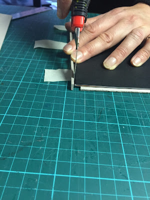
Next I cropped the excess bleed/white pages.


 I then measured up mount board the a couple of mm bigger than my page sizes and sandwiched my book in between in order to measure up an estimated spine using mount board also. Ensuring all the measurements were as accurate as possible.


A gap was left.


Next  tape was used to hold the board in place whilst I chose a black material to cover it. The dimensions of the mount board was then drawn onto the reverse of the black fabric and then stuck down using PVA glue.


The outside was scored to create the shape and then cut out leaving a rulers width of material all around. The corners were then sliced leaving a tiny gap in order for the mount board not to be visible. PVA was then placed around these edges and then as they were stuck down on the inside of the board.


The black card pages stuck prior to this were then carefully stuck in place on the board.

And finally the book was placed into a larger presser.


I then measured around the book to ensure the dust jacket/ cover was the correct size and then printed it. 


I cropped and cored the book jacket and wrapped it around my book. In the process of this a couple of things went wrong which I will state in my evaluation. 


Friday, 13 November 2015

Dalton Maag Type Workshop

Dalton Maag Type Workshop

Today we had a professional come in from Dalton Maag. After a presentation on various aspects of type we were set a task to complete a reconstruction of the word HAMBURG in a certain typeface. We were left to figure out what the letters look like using the sheet we were given. After completing it the professional came round and praised me on most of it and said it was done correctly however he then stated that I needed to make sure my connections weren't sharp, I soon figured out what he meant and corrected it. I enjoyed the raw, hand-rendered way of working out how type is supposed to go.


OUGD504 - Studio Brief 03

Type in Context Publication

I started by researching into binding methods different to what I had perviously learnt about last year. I created a perfect bind and an a case bind as these were two binding methods I thought would work well for my publication.


After creating both I decided on the hard back cover, however I had to think further into how I would incorporate a front cover onto the material that is stuck onto the mount board. I initially thought about screen printing a type title onto it but I didn't feel this would be as effective as my second idea. To create a wrap around cover on a thin gloss stock. This is called a dust-jacket. The dust jacket (sometimes book jacketdust wrapper or dust cover) of a book is the detachable outer cover, usually made of paper and printed with text and illustrations. This outer cover has folded flaps that hold it to the front and back book covers. Often the back panel or flaps are printed with biographical information about the author, a summary of the book from the publisher (known as a blurb), and/or critical praise from celebrities or authorities in the book's subject area. In addition to its promotional role, the dust jacket protects the book covers from damage. However, since it is itself relatively fragile, and since dust jackets have practical, aesthetic, and sometimes financial value, the jacket may in turn be wrapped in another jacket, usually transparent, especially if the book is a library volume.


After measuring it out effectively for an A5 Book I created a simple grid system to ensure I not only cropped it accurately but I typeset my text central to where the folds would be.


This cover design was created to ensure the best possible chance of my target audience wanting to pick it up. book cover is any protective covering used to bind together the pages of a book. Beyond the familiar distinction between hardcovers and paperbacks there are further alternatives and additions, such as dust jackets, ring-binding, and older forms such as the nineteenth-century "paper-boards" and the traditional types of hand binding. As I believe although a book shouldn't be judged by it's cover, it does serve a highly significant purpose of giving the target audience a desire to want to buy, pick it up and read it. The orange colour scheme was therefore used to make the book vibrant and unique. The sans serif type used (Futura Medium) is easily legible and playful against the orange. 


The initial design of the front page seen above was created using a complex grid system in order for the circle to be completely central and allowing room for any other text if needed. The central wavy circle used around the main front page is to create a level of hierarchy in order for the title to be the first thing the reader is drawn to. as it is the most important element. I have constructed it in a way that it is able to stay without falling off without any glue involved. This is created by the outside flaps folding round into the inside of the hardback cover and being folded inside and enclosed with the inside pages of the book. 


I created some light orange stripes to bleed out onto the inside flaps to create a connection between the pages even when folded.

I then added an A and a Z above each of the flaps to make it look slightly more complete and to fill up the space. I also added a blurb, which is a short promotional piece accompanying a creative work. It may be written by the author or publisher or quote praise from others. Blurbs were originally printed on the back or rear dust-jacket of a book. 

After measuring it all out and creating a mock up of the hard back the cover somehow ended up not fitting around it as the measurements were inaccurate. So therefore I decided to leave the measurements for now until I created my final hard back cover and to measure them then to ensure that the measurements are completely correct. 


Thursday, 12 November 2015

OUGD504 - Studio Brief 03

Layout Design


Editorial design is something I am not very familiar with so I decided to research it in quite some depth as I felt like I literally had no where to start. Although after researching it became apparent 


I noticed that most of them used a column grid system to type set all the content. They also used black and white imagery along with triangles and images that fall outside of one page. 


I decided to use some of these elements in order to make my layouts follow a structure and look more professional. I also wanted them to be simplistic and easy to read, so I did add any page numbers to avoid confusion and also due to there only being a few pages I didn't feel this was as necessary. I also didn't add a contents page or a glossary for the same reason.

I started by creating a 2 column per page grid system and type set the information onto the page onto one of the column. I then edited my image making it fit into the column system and I used the gamut warning feature in photoshop to ensure that my image was ready to print and looked exactly how it should on screen. From RGB to CMYK. I then zoomed in onto the A in the photo that I wanted to make apparent and made a vector in photoshop. I placed this against a dark blue background to fit in with similar colours used in the photograph. I then decided this was a theme that I would use throughout my book.


I used the 2 column grid system throughout all my layouts to keep it consistent. Here I placed a opaque green triangle across the page in contrast to the black and white image behind to make it more visually appealing and interesting. I also researched the co-op throughly and I found out that it is a well established brand so I knew the audience would be familiar with the green and dark blue colour scheme used as it is commonly used in their logo. This will enable the reader to instantly link the colours with the brand without even reading the information. A big C in Helvetica was placed across the right hand page to mark the letter being discussed. The font Futura was used throughout of my layouts to eliminate 100% variation of the pages. I designed each page to be different to create a dynamic visually pleasing book however keeping the fonts the same ensured I had at least a little bit of organisation. 

My photographs weren't the best quality also so I found it very important to use vivid colours to attract the readers attention. On page D I used bright reds similar to the signage.

Here I placed the imagery over a double page spread as it was one of my best quality photographs taken. I simply used a dark green and a whit text to ensure maximum legibility. 
 I took the orange from the image a placed an opaque triangle overlay to eliminate dull nature of the photograph by its self.
 All of the other pages followed the same rules. On the final page I sliced the image diagonally and made it half black and white. I took the S from the sign and created the typeface in gold on the top left of my page where I created a brown column for the text.

I wanted to spend more time on the production aspect of this design rather than the design interior as this is what the module was focusing on in more specifically.