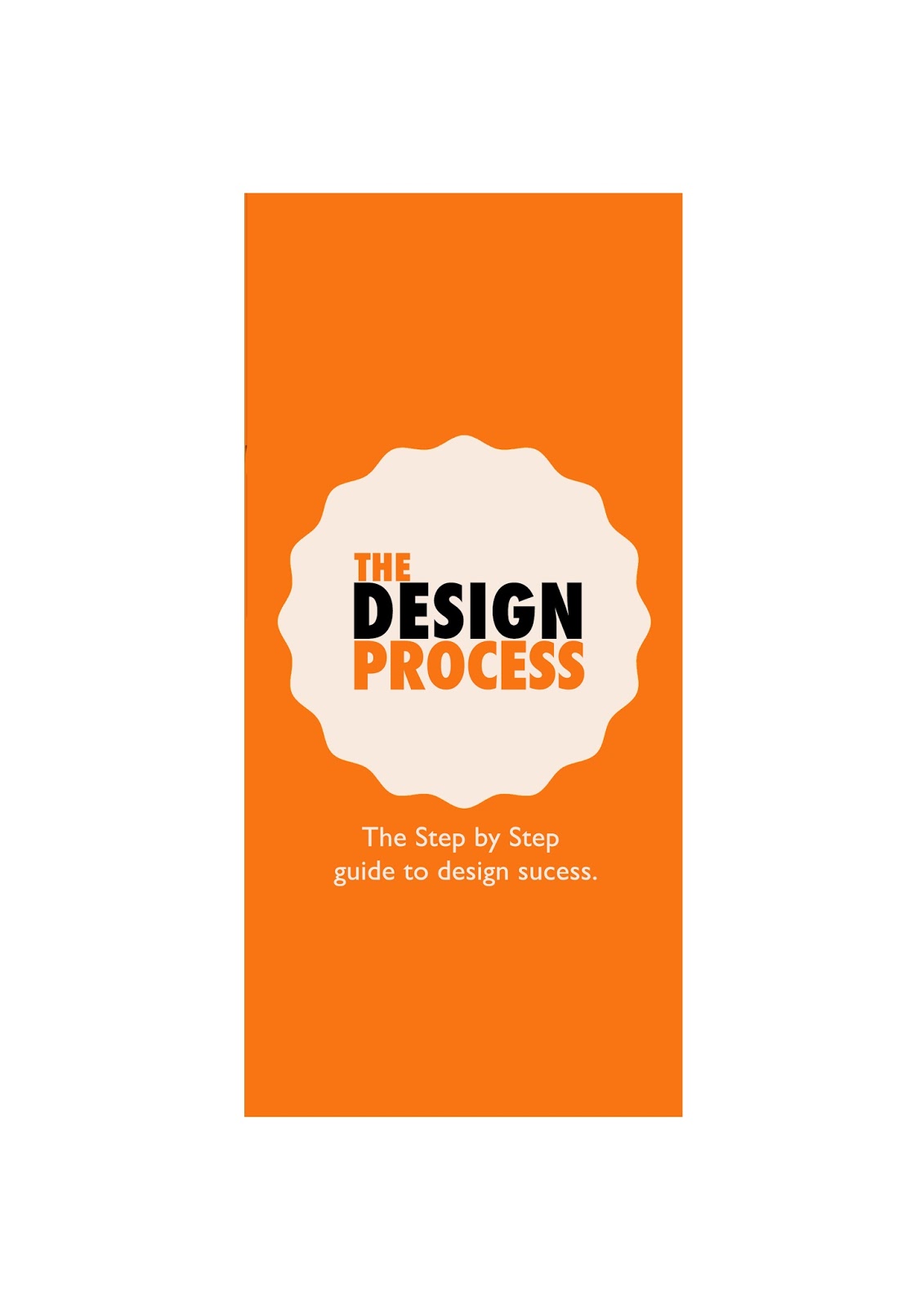
I started by experimenting with different folds but I eventually decided to stick with a simple Tri fold as i believe design should be effective and making the folding simple i felt this did this correctly. Also as I was aiming it at the Level 4 students I wanted the the leaflet to be simple but slightly interactive and the colours to be eye catching and vibrant so they would want to pick it up. I chose the colours, black orange and a slightly off white to tie into a building block styled theme similar to B&Q giving of connotations of building and structure within the design process.
My front page I found was the most effective and this was recognised by my peers in the feedback session earlier today. They stated that the typeface for the title was bold and eye catching and the colours and shape used worked effectively in communicating structure.Therefore I decided not to change anything on the front page.
The inside pages I decided to use a serif font named Century in uppercase letters for my titles as I wanted to give it a traditional theme however in the crit I was told this contrasted with the front page and wasn't very effective. So I therefore decided to change all of the titles into the same font used on my front cover title, Futura condensed bold. I also changed the kerning slightly to make it more legible. I moved around some of the letters however I kept the lines used to keep the structure again tying into my concept.

I created an easy to follow simple flow chart of step by step guide to the design process with words to prompt individuality within the design process and to make the reader think more deeply instead of giving all the information and explaining what each one meant. I used arrows to help the information flow but changed the colours after the crit as it was stated it initially gave of connotations of Halloween, something which I definitely didn't want. I decided to change the blacks to the off white colour to eliminate this concept immediately.

Within the production process I found it difficult to print the leaflet two sided effectively however through trial and error I corrected this and I was very pleased with the outcome.


I used the thin white paper in the printer as my stock as it was a cheap and effective material to use, especially due to the time constraints. It was also easily accessible and easy to fold.
No comments:
Post a Comment