Wednesday, 23 December 2015

OUGD504 - Only Studio Brief

Desktop Version of Website Campaign for Kehlani's album 'You Should Be Here'


I started by finding a good quality sunset background and edited it on photoshop so it had a feminine pink/purple overlay to link back to the artist. I used a sunset back ground to associate back to the title of her album, as beach and sunsets are normally linked with holidays, a place where you tend to wish someone else was with you. I used this background to act as similar to a pre loader page however once loaded up the user then has the option to hover over the enter site link which once hovered over by the cursor will change to a purple to create a clear interlink into the webpage contents. I used the typeface MF Queen Leela as it was similar to the typeface that Kehlani uses on most of her album artwork and I wanted her fans to recognise who it was through the common themes I adopted.


Once the user has entered the site, they can see clearly where things are located as I have designed a banner which includes all of the things the user might want to browse to do with album/artist. Such as new releases, youtube videos, sign-up to newsletter and information and the store where the user can purse deluxe versions on the albums as well as things like T-shirts, posters and mugs etc. Easily purchasable and cheap merchandise will help advertise her album as well as creating up a hype, therefore hopefully contributing to more sales of the album. There are also links to her social media pages such as Twitter, Facebook and Instagram. Social media is also the perfect way of spreading the hype of an album.

The top left also shows a simple logo I created using the typeface Mf Queen Leela. Creating this logo just enables the user to easily recognise her and also have a clear link to the brand, the logo would not only be on the website but on merchandise too, again spreading more hype for the upcoming album.

The website will simply have one continuous scroll, the next page having links to her different mix tapes straight onto Soundcloud (An online music streamer, used by Kehlani herself) so the user can listen to her tracks for free simply by having an internet connection. After listening to the tracks, hopefully this will entice them to download the album and none of the tracks featured here will be featured on the new album. Meaning the user will be curious as to hear them.


Once the user continues to scroll down they will come to 4 or 5 videos with a play button over. Once they click onto the play button the link with youtube  will directly send them to the music video on YouTube so they can listen to her previous tracks.


Next the user will come to a page dedicated to Kehlanis recent Instagram posts, which will continuelsly refresh once she uploads a new one so the user will be able to have an insight into Kehlanis day to day life and grow to like her more, therefore wanting to purchase her album. Each post on each page is using the Only studio Grid system to aid consistency.


The final page is Kehlanis Tour dates where the user can find information of the location of her tours and if click on the link to purchase tickets on ticket master will become available.


Mobile version of website Campaign for Kehlani's album 'You Should Be Here'


The pre loader page will simple fade into a circle instead of having to be clicked on. A slight variation to the desktop version. This just makes the links speed up slightly and avoids confusion.


The top right of the design has a hamburger icon. Once clicked on this just shows a drop down menu with the same features on as the desktop banner such as releases, youtube videos, sign-up to newsletter and social media links.

Below a image of the album cover and an easily accessible link to iTunes pre order.


The next page is similar to the desktop version however instead of a link to Youtube the video just simply expands on the app screen and plays with the logo and hamburger icon in place. To pause the video the screen is pressed one to get out of the video the hamburger icon is pressed to give the option to go back to videos.


Similar to the Instagram app the photos are shown on a continuos scroll and updated frequently.


The final page again shows the same information as the previous desktop page of tour dates.


Monday, 21 December 2015

OUGD504 - Only Studio Brief

Kehlani

Kehlani Parrish (born April 24, 1995),known professionally as Kehlani, is an American R&B singer songwriter who is currently signed to Atlantic Records. Kehlani is originally from Oakland, California  where she achieved initial fame as a member of the teen pop group, PopLyfe, which was a finalist on America's Got Talent, She released her first MixtableCloud 19, in 2014.The album was listed among Complex's "50 Best Albums of 2014." Kehlani's second mixtape, You Should Be Here remiered at number 2 on the national R&B charts in 2015 and preceded her sold-out North American tour.

Wednesday, 16 December 2015

OUGD504 - Campaign Web Design

I created this web design taking inspiration from Jess Gylnne's original website altering it slightly in a way I thought would look better. However after the crit I decided to change my artist so I deleted all these original designs.

In the crit I was told the entrance page worked well as well as the logo I had created for her using the font so I knew I would keep this when working on the other artists webpage.


Tuesday, 1 December 2015

OUGD504 - Studio Brief 04 - Campaign Web Design

Campaign Web Design

After looking at various campaigns and websites for young artists with recent album releases I realised they all adopted similar features which had been proved to work. For example on Justin Biebers website there was large images of him, his name/logo was hand rendered, he had various videos photos but mainly the website seemed to promote his world tour.

The features I established were, videos (YouTube), photos (Instagram), Album Cover/Artwork with links (iTunes), news letter, tour dates and recent news.
I decided therefore these will all be features on my website.

I also looked into Jess Glynnes existing website and I really liked the layout and colour scheme as it was easy to use, feminine, visually appealing and structured. 


As I felt it was already effective, I felt adopting a similar strategy would work well.

Monday, 30 November 2015

OUGD504 - Studio Brief 04 - Research

Campaign Websites

Essentially, what we have been asked to create is an advertisement to promote our chosen artist and increase sales of their album to ensure chart success. Not all websites are their to serve the purpose of 100% advertisement. Some are simply their to provide information, or entertainment etc. Establishing the difference is important when creating a website for this particular purpose. 


After looking into various artists I could use, I chose Jess Glynne for a number of reasons. The first reason being, it being her very first album so it is important and very vital and integral in creating her success. So therefore creating this website would be important. She has also only recently broken through into the music industry at the top of the charts and becoming one of the top female artist's in the world. Her breakthrough was during 2013, where deep house producer Route 94 approached Glynne about rewriting and providing vocals for a song of his, called "My Love" which at the time contained a sample that he was prohibited from using. "My Love", featuring Glynne, was released on DJ Annie Mac's compilation album Annie Mac Presents in October 2013. Electronic group Clean Bandit heard "My Love" and approached Glynne to feature on their song "Rather Be". Jack Patterson of Clean Bandit spoke of "a real subtlety of emotion in her voice You can hear the fragility of her personality, but at the same time there’s a raw power'.
Released as a single in January 2014, "Rather Be" debuted at number one on the UK singles, becoming the third fastest-selling single and the most streamed song of 2014.The track attained number-one and top-five positions on charts across Europe and Oceania, and was a top ten hit on the US Billboard 2014. In February 2014, Route 94's "My Love" was released as a single; it also debuted at number one in the UK. Both "Rather Be" and "My Love" received nominations at the BRIT Awards for Best British Single.For her work on "Rather Be" Glynne won the Grammy Award for Best Dance Recording and was nominated for Song of the Year at the inaugural BBC Music Awards.
Her new album "I Cry When I Laugh" was only recently released in August 2015 so she is still trying to promote it. The album features contributions from Knox Brown, Naughty Boy, Starsmith, Talay Riley, and Switch, as well as her regular collaborators Bless Beats and Jin Jin. She also made an appearance on the 12th series of The X Factor a guest judge at Cheryl Fernandez-Versini's Judges' Houses segment. The same month, she presented the Vice magazine-produced documentary film The Brit Invasion, which documented the rise of EDM and British dance music in the United States. Glynne's track "Take Me Home" was released as the official Children In Need 2015 charity single in November.
These are all things that can be key activation points across the key 5 markets on my website.

Thursday, 26 November 2015

OUGD504 - Studio Brief 04 - Wire frames

OUGD504 - Studio Brief 04 

Wire framing is the first process in web design after producing your grids. Low fidelity wireframes are perfect as a way to show your customer/client an insight into what your design will be like without explaining the whole process of each page along with codes etc. 


Below is a simple grid designed for desktops (1600px by 1000px) it has 12 columns. This column system can be applied with mobile devices (320px by 565px) having 4 columns and tablets having 8 columns. All things that web developers need to consider


Then simple boxes of page elements are added to the grid system such as a company logo, a title, a header and footer, photographs, navigation banners etc in a certain hierarchy. This is then shown to the client and any changes can be simply amended. This also gives them the opportunity to add extra features that may not already be on there such as videos etc to create an overall better design. 

After these elements are finalised. It is essential to add functionality, this involves things such as animations, buttons and other moving elements. It is also extremely important to add colour to the design as it enables to define the different sections of the site. 

Then once the basic elements are all put together, the final touches can be added. Including the images and other functions, so that the developers are able to add the necessary code.

Tuesday, 17 November 2015

OUGD504 - Book Binding a Case Bound 5 Hole Pamphlet stitch

5 Hole Case Bound Pamphlet Stitch


I wanted my final design to be sleek and professional looking so I decided on a hard back cover with a wrap around dust jacket front cover. The pamphlet stitch usually consists of 3 holes in the fold which are stitched together to hold each page in place however I decided to use 5 holes in order for it to be more secure as the first hard back pamphlet stitch I made was a lot smaller and turned out loose. As my book was A5 I wanted it to be as secure as possible. 


 I started by measuring out the middle of my pages and piercing a hole through, then at each edge of the page and then again in the centre of the middle and the edge so I was left with 5 even holes across the pages.


Next I took a needle and thread and threaded through each hole and secured it with a tight knot. I then cut the thread leaving enough for it not to become loose and fall apart. I threaded through on the outside as as this will enable the thread to be come invisible when stuck onto the hard back cover, whereas on my previous hard back cover I left the thread on the inside which made it visible on the inside. By doing this it just enabled me to leave the design looking a more visually appealing.


Next I cropped a sheet of black card the same size of my pages folded on each side of the first and last page. I decided to use black as I wanted my cover design to be consistent throughout.


 These pages were then glued on using pritt stick instead of PVA glue. The reason for this was because of the type of stock I chose to use for my interior pages.  I had chosen a magazine type shiny stock which wouldn't stick as well with PVA glue. Only half of the card was glue to the front and back pages to ensure that the book made more leeway to open and close without ripping.


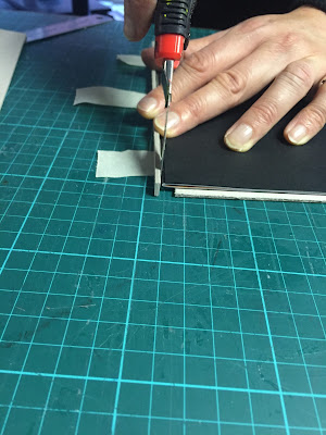
Next I cropped the excess bleed/white pages.


 I then measured up mount board the a couple of mm bigger than my page sizes and sandwiched my book in between in order to measure up an estimated spine using mount board also. Ensuring all the measurements were as accurate as possible.


A gap was left.


Next  tape was used to hold the board in place whilst I chose a black material to cover it. The dimensions of the mount board was then drawn onto the reverse of the black fabric and then stuck down using PVA glue.


The outside was scored to create the shape and then cut out leaving a rulers width of material all around. The corners were then sliced leaving a tiny gap in order for the mount board not to be visible. PVA was then placed around these edges and then as they were stuck down on the inside of the board.


The black card pages stuck prior to this were then carefully stuck in place on the board.

And finally the book was placed into a larger presser.


I then measured around the book to ensure the dust jacket/ cover was the correct size and then printed it. 


I cropped and cored the book jacket and wrapped it around my book. In the process of this a couple of things went wrong which I will state in my evaluation.