Thursday, 31 March 2016

OUGD505 - Studio Brief 02

Examine graphic design outputs relating to social, political and ethical change. Aim to increase your awareness of historical examples plus contemporary practice that is responsive to 21st Century issues. Be sure to note the relationship between medium and message.You should then produce a body of research work that explores the connections between these concepts and their respective design outcomes prior to your own practical and conceptual exploration of possible products, ranges and methods of distribution that may be suggested by your preferred content or, indeed, those that reflect your own ideologies, concerns and/or ambitions.
Background / Considerations
This brief is in two parts -
Part 1:  Based on the introductory workshops, develop a practical, visual and contextual investigation of a specific subject. You should aim to develop research from a range of primary and secondary sources in order to fully explore the opportunities for informed creative development. Your research and development of this part of the brief should be documented on your Studio Practice blog and will be presented as part of your interim concept pitch.
Part 2:  Devise and develop a body of practical work that both distils your knowledge of an identified issue and demonstrates your ability to tap into the market potential for socially, politically and ethically-driven design. This output should still work within the broader creative and professional contexts of graphic design but could be based around ideas of awareness or protest. Examples of potential deliverables include (but are not limited to):
  • materials relating to an issue-led campaign (this could be one affiliated to an established organisation or a more ‘guerilla’ approach)
  • a poster series
  • a booklet/publication/manifesto
  • a web/digital platform
  • placards, banners or a set of badges
  • a range of products or merchandise that communicate your identified core message
Your contextual research, critical observations and reflective evaluations should be documented on your Studio Practice blog and summarised within reflective content that supports your design submission. Your response should explore the relationship between product range and methods/media of distribution as well as specific audiences, contexts and appropriate tone of voice. 

Wednesday, 30 March 2016

OUGD503 - Studio Brief 03 - Project Report

http://issuu.com/katiebull/docs/project_report

https://drive.google.com/file/d/0B6bo5RQ7QVxfaWIxSXg1QjNCY00/view?usp=sharing

Project Report

Studio brief 01 individual practice was the perfect way for a young creative to focus on work not just only on a selective creative level but also a higher industry and commercial level. Selecting your own briefs is a way for a designer to be introduced to a real world setting, picking briefs based on their individual preferences and skill sets challenging them to outsource what is best for them to boost their creative confidence and produce a more informed higher quality outcome. It is important for a designer to pick the design brief to ensure that the outcome is not based on the design aesthetics but a representation of the businesses need for a designer and a clear focus on the clients aims and objectives. The designer can then decided whether the brief is suitable to them or not instead of trying to fulfills a brief that isn’t. Where as if they were given a brief that wasn’t suitable to them it can result in a poorly executed design, giving them a bad reputation and compromising their career.

For the reasons stated above I decided to pick the Feel Good Drinks brief, as I have a keen interest in the drinks industry as well as advertisement campaigns I wanted to challenge myself to gain new skills and work on a higher industry level.

The brief wanted to spread feel good and positivity on the radar of young women but after looking further into the business aims they stated that they actually wanted to increase sales targets. I loved this brief as it was a chance for me to use my literacy skills to a higher level of industry design through an advertising campaign, in order to fulfill the aims of a business. I also have a keen interest in branding and identity, I felt I could use my expertise in this area of creating visually engaging design as well as challenging myself to use these skills on a more business related commercial level for example, to fulfill sales targets (the businesses aims). Therefore my response to this brief was based more around the business aims than the actual attractiveness of the design. I researched thoroughly into different ways to engage an audience through literate skills. I researched into slogans, illation and metaphors to show that I am creative on different levels of the industry, not just through how something looks. I wanted to create a direct link quickly to the USP (Unique Selling Point) of the product, of no added sugar or preservatives through the use of a short, snappy and memorable slogan.

After deep consideration and variations I came up with “Free the fruit, from the fruit, feel good.” To ensure that the audience knew that it was all natural ingredients, I placed this slogan on a poster advertising the cloudy lemon juice drink, the least popular juice drink which I felt could be the most successful for the brand. I wanted it to be the main drink in the brand as lemons give of connotations of fresh and juiciness, words I wanted people to associate with my brand. I have learnt that design is much more than just visual appearance and it is important to use other skills to help execute a message to the target consumers. However I felt that I could’ve managed my time abit more effectively on this brief as most of my time was spent researching different ways to engage an audience through English skills rather than more time producing the campaign. It took me a while to come up with the slogan, where as this time could’ve been spend making more variants of posters on the different products, although I do not feel that this time was wasted as I think the slogan was the most important aspect of my poster design and focusing on just the one least popular drink could have had lead to a significant increase in sales of that product, rather than advertising all the flavors.
Working on this brief has also giving me an insight into how the advertising industry works and it has given me an opportunity to head down a potentially different career path in advertisement. I feel that this has evidently been presented in my work through the use of a slogan and not just the appearance of the design.

For my smaller briefs such as Penguin and Secret 7 I spend a little more time focusing on the design aesthesis but also my ideas where based around concept. The penguin brief was a chance for me to be introduced into book cover design. I also decided to pick Caitlin Moran – How to be a woman as it was a personal topic to me as it was focused around feminism. I decided to complete this brief mostly based around the context of the publication rather than what title I thought I could make look the most visually attractive. The books context discusses feminist ideologies something which I have a keen interest in and which I am passionate about. Being passionate about what you’re doing tends to be the main driving force behind creativity, which tends to make you better.  I hadn’t produced a book cover before so I found it quite difficult at first but I soon overcame this problem when I researched into it, teaching myself and improving my skill set and expertise, something I otherwise would’ve avoided and therefore not learnt. I taught myself that it is essential not to shy away from things you are uncertain of yet challenge yourself in order to better yourself as a designer. Self- teaching is the perfect way to become more successful in the design industry.

Despite this, I found that my response had a very strong concept which used a pole dancer as an ironic approach to the sexual gratification of women through the male gaze. A topic discussed within the book. I felt that my solution was comical as well as informative because of the deeper message being sent. I researched the topic in depth so that I was extremely clear on the message that I wanted to send which enabled me to fuel all potential ideas. I also focused on the target audience to create motivation, incentive and emotion to give out visual metaphors which convey the topic through the use of imagery, colour palate, typography and layout. I learnt that research is a vital part of working on a commercial level as researching the topic as well as the clients and their aims. It can make you focus the design around the marketing and promotion of a product via a strong concept, argument and message. In the future I would like to do some more editorial design and improve my layout skills, however I don’t think I would want to work on this side of design as although feminism is something I am passionate about, not all books are written on this and some topics might not interest me as they can be very varied. As editorial/ book cover design is a weak point I think it is best to focus on my stronger skill sets.

The secret 7 brief was a way for me to use my other hobbies and interested to my benefit. The brief wanted us to create 7 x 7 inch album cover design based on one of the seven tracks given. It was also a chance for me to create something based solely for no other purpose than its visual appeal as winning entries to the competition were exhibited and sold simply by the cover alone. The cover needed to be representative of the track in order for the buyer to make a direct link to it however, it wasn’t necessary for it to be completely obvious. Album cover design is integral to the success of an album or track as it is what visually symbolize the sound. For the production of my album cover I based it around not only the lyrics of the song but around the genre, artist, tempo. Key, pitch, melody and tone etc in order to clearly visualize the track in a design context, converting sound into vision. Working on this brief helped me to focus specifically on the design attractiveness rather than for a specific purpose as it is easy to get caught up in the reason for design and making the visual appearance lack in certain qualities as not everyone will think deeply into the meaning as consumers aren’t all graphic designers they focus on how the design looks rather than what message it is trying to portray. Good design tends to give of a message instantly without the consumer analyzing it or even realizing.

Studio Brief 02 collaborative practice wanted us to outsource a collaborative partner who matched our requirements of skills needed for a particular brief best suited to us. Good designers rarely go about designing something in a industry setting without the input of peer-designers. It gives the design a breath of fresh air in order to create a new thinking perspective from someone other than yourself, which in the long run improves the design. This was evident when I designed the logo for Grand Café Coffee the first logo I designed was reflective of a hotel, however I didn’t see this and I thought the design was sophisticated and luxurious the concept that we were going for. However, after the discussion with my partner it opened by eyes up to new opportunities for the design to steer away from it looking like a logo for something it wasn’t. This improved the design dramatically. Although I was still designing It on my own having this outside view made my design more effective for a coffee brand.

Also our skill sets complimented each other as I created the logo design she created the package design something I lack skills in but wanted to learn about. My partner therefore taught me skills I didn’t know which enabled me to learn as well as grow as a designer. This proved that I had in fact picked the right partner. We also were on the same course which meant time management was easy as we were both free at the same time so we got the work done quicker and to a good standard. I definitely want to collaborate more in the future as it is evident in the presentation of my designs that working with someone else enabled us to do things we couldn’t do on our own as well as better our design dramatically, through the use of accessible useful feedback.  


Thursday, 10 March 2016

OUGD503 - Finding a Collaborative Partner

Finding a collaborative partner 

We had a lecture where we gave 3 slides on a slide show to give other students from different courses a chance to work with us. 


This brief wanted us to outsource a collaborative partner who matched our requirements of skills needed for a particular brief of our choice. What brief and partner we chose was up to us,however they needed to match our skill sets as a partnership. In the world of design-thinking collaboration is an esteemed means to an end. 

Good designers wouldn't go about designing anything without the input of peer-designers and colleagues from other core-competencies. Similarly from a design thinking perspective, one wouldn't go about designing anything new without any form of input. Again similar to the last brief, we were challenged on expanding our skill sets by learning from others as well as working on a higher creative level in an industry 
standard setting.  Collaborative enables you to be aware of what you bring to the table, what you are great at and what you aren't so great at.

 So therefore your partner can fill in the gaps. More effective problem solving happens when you combine resources in talent and experience. Sharing and leveraging those resources means that your reach to new markets increases and re-energizes the connection you have with established customers.  Your skills sets can compliment each other. Although sometimes things don't work out well when you collaborate with others, no matter how hard you try, how patient you are, and how well you listen. So for this brief it was extremely important we picked the right partner.

Wednesday, 2 March 2016

Studio Brief 01 - Licence To Print Money - Research


Banknotes

As there are a lot of currencies in the world, I decided to only focus my research on the uk as this was the currency I was going to redesign. 
 
Sterling banknotes are the banknotes of the United Kingdom and British Islands, denominated in pounds sterling (GBP).
  • £5 (five pounds)
  • £10 (10 pounds)
  • £20 (twenty pounds)
  • £50 (fifty pounds)
    each denomination has its own size and colour
Queens HeadAll our bank notes bear HM The Queen's head on one side and a famous historical person on the other side.
Queen Elizabeth ll is the first monarch to have her portrait printed on a bank note. It was first done in 1960 as a way of helping to prevent forgeries.
front of 5 pound note
five pound note
£5 (5 pounds)
The current £5 note features Elizabeth Fry, who made her name fighting for improved living conditions for women in European jails.
(Old £5 note features George Stephenson. Ceased to be legal tender on 21 November 2003)
Actual note size: 135mm x 70mm (approx.)

ten pound note front
ten pound note
£10 (10 pounds)
The current £10 note features Charles Darwin, the Victorian naturalist who developed the theory of evolution. Also pictured is an illustration of Darwin 's own magnifying lens and the flora and fauna that he may have come across on his travels.
Actual note size: 142mm x 75mm (approx.)

twenty pound note front
twenty pound note
£20 (20 pounds)
The current £20 note features Sir Edward Elgar, a British composer whose orchestral works include Enigma Variations (1896) and five Pomp and Circumstance marches (1901–1930).
Actual note size: 149mm x 80mm (approx.)
The Bank of England issued a new-style £20 note on 13 March 2007 . The note features Adam Smith, one of the fathers of modern economics, on the back and incorporates enhanced security features.
The new-style £20 notes will circulate alongside the old-style Elgar note which will be progressively withdrawn from circulation. The date when its legal tender status ends will then be announced, as is usual practice.
£50 (50 pounds)
The current £50 note features Sir John Houblon, the first Governor of the Bank of England.
Actual note size: 156mm x 85mm (approx.)
Quid
The slang term for a British Pound is Quid. One pound sterling is referred to as "A QUID", five pound sterling as "Five Quid" and ten pound sterling as "Ten Quid".
Other names for a pound coin include a smacker, or smackeroon.
The two Banknotes with other names are the "Fiver" (£5) or the "Tenner" (£10) .
For example "It only cost me a tenner"

New 20 pound note

£20 Note (Adam Smith) - Security Features

Security Features  |  Design Features
£20 Front£20 Back

Feel of the PaperFeel of the paper - banknotes are printed on special paper that gives them their unique feel. 
Raised printRaised print - by running your fingers across the front of the £20 note you can feel raised print in areas such as the words 'Bank of England' and in the bottom right corner, around the number 20.
ThreadMetallic thread - there is a metallic thread embedded in every banknote. This appears as silver dashes on the back of the £20 note. If you hold the note up to the light the metallic thread appears as a continuous dark line.
WatermarkWatermark - hold the £20 note up to the light and you will see an image of the Queen's portrait together with a bright £20.
Quality of the PrintingPrint Quality - the printed lines and colours on the £20 note are sharp, clear and free from smudges or blurred edges.
Micro-letteringMicrolettering - Using a magnifying glass, look closely at the lettering beneath the Queen's portrait on the £20 note - you will see the value of the note written in small letters and numbers.
Fluorescent feature
Fluorescent feature
Ultra-violet feature - if you look at the front of the £20 note under a good quality ultra-violet light the number 20 appears in bright red and green. Randomly spread bright red and green flecks are also visible on both the front and back of the note. The remainder of the note appears dull in contrast.
Holographic stripHolographic strip - the strip on the £20 note has a number of foil patches along its length which contain alternating holographic images. The positioning of the patches varies along the strip. When the note is tilted, one hologram shows a multi-coloured image of Adam Smith, the other changes between a multi-coloured £ symbol and the number 20. The number 20 is also embossed on the strip and is positioned in the same place on every note - just to the right of the signature of the Chief Cashier.
See-through RegisterSee-through register - hold the £20 note up to the light and you will see coloured irregular shapes printed on the front and back that combine to form the £ symbol.


The new 20 pound note was introduced with these features to help prevent forgery. The 20 pound note also tends to be used the most frequently so the old note was becoming more worn meaning they need to somehow get it out of circulation and update it  with features such as better quality paper to prevent things like this happening again. 

Pound sterling

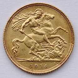
Half sovereign minted in Sydney, Australia, 1914 features St. George and the dragon
George IV sovereign, 1828
Queen Victoria half crown in silver. 1886
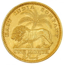
Gold Mohur of the East India Company, 1840
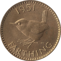
The farthing, 1951
The pound sterling (GBP£ or ) is the official currency used in the United Kingdom. It is also used in British overseas territories, Isle of Man, Bailiwicks of Guernsey and Jersey. The pound is divided into 100 pence.
Today's coins are 1 penny, 2 pence, 5 pence, 10 pence, 20 pence, 50 pence, £1 and £2. The notes are £5, £10, £20 and £50.

Etymology

A pound coin originally weighed one troy pound of sterling silver, giving the currency the name "pound sterling". "Sterling silver" means mixed metal that has 92.5% or more real silver. One pound sterling was originally divided by 240 sterling pence. This was because there are 240 pennyweights in a troy pound. So a single one–pound coin weighed one troy pound and a single 1–penny coin weighed one pennyweight.
The Latin word for "pound" is libra. The £ or ₤ is a stylised writing of the letter L, a short way of writing libra. This is similar to how a pound of mass is abbreviated "lb". Up until around the 1970s, especially on typewriters or keyboards without a "£" symbol, it was common to write "L" instead of "£".
The symbol for pennies is p (pronounced "pee" like the letter). The British write 50p or £0.50 and say it "fifty pee".

The old system

The pound has only been divided into 100 pence since 1971. Before this time it was divided into 20 shillings. Each shilling was divided into 12 pennies.
The symbols for shilling and penny came from Roman coins: "s" for shilling (from the Latin word solidus) and "d" for penny (from the Latin denarius). The penny was divided into 4 farthings. The farthing became obsolete (was no longer used) in 1961 because it was worth so little.
Coins just before the change in 1971 were: 1/2d (ha'penny), 1d (one penny), 3d (threepence; the coin was called a "thrup'ny bit"); 6d (sixpence); 1s (one shilling, also called one "bob"); 2s (a florin); 2s6d (half a crown; the crown, 5s (a quarter of a pound sterling), was not used in modern times).
How prices were written and pronounced in the old system:
  • ½d (half a penny) was pronounced "haypenny" (spelt: ha'penny or halfpenny)
  • 2d (two old pennies) was always pronounced "tuppence"
  • 3d (three old pennies) was always pronounced "thrupence" or "thruppenny bit" for the 3d coin" (spelt threepence)
  • One shilling was written "1/–" (sometimes called a "bob").
  • Prices in shillings and pence were pronounced like this: 2/6 (or: 2s6d) "two and six" (or: "two shillings and sixpence").
  • The price £4 6s 3¾d was pronounced: "four pounds six shillings and thruppence three-farthings"
There was also a guinea. Originally the guinea was a gold coin. Although the coin had not been minted or circulated for a long time, prices were still sometimes given in guineas. A guinea was 21s (or £1 1s 0d). A price of 58 guineas was, in fact, £60 18s 0d, which sounds more than "58 guineas".

Coins

(Following the Great Recoinage of 1816)
UnitsPenceShillingsPounds
Quarter Farthing116d1192/-£13,840
Third Farthing112d1144/-£12,880
Half Farthing18d196/-£11,920
Farthing14d148/-£1960
Halfpenny12d124/-£1480
Penny1d112/-£1240
Threepence3d14/-£180
Groat4d13/-£160
Sixpence6d12/-£140
Shilling12d1/-£120
Florin24d2/-£110
Half Crown30d2/6£18
Double Florin48d4/-£15
Crown60d5/-£14
Half Sovereign120d10/-£12
Sovereign240d20/-£1
Double Sovereign480d40/-£2
Quintuple Sovereign1,200d100/-£5

Notes

(Following the Great Coinage of 1816)
UnitsPenceShillingsPounds
Ten Shilling Note120d10/-12
One Pound Note240d20/-£1
Two Pound Note480d40/-£2
Five Pound Note1,200d120/-£5
Ten Pound Note2,400d200/-£10
Fifteen Pound Note3,600d320/-£15
Twenty Pound Note4,800d400/-£20
Twenty Five Pound Note6,000d520/-£25
Thirty Pound Note7,200d600/-£30
Forty Pound Note8,400d800/-£40
Fifty Pound Note9,600d1000/-£50
One Hundred Pound Note16,600d2000/-£100
Two Hundred Pound Note33,200d4000/-£200
Three Hundred Pound Note49,800d6000/-£300
Five Hundred Pound Note120,00010,000/-£500
One Thousand Pound Note240,000d20,000/-£1,000

Decimalisation

In circulation before 1971 were the halfpenny, penny, threepence, sixpence, shilling, florin, crown, sovereign, ten shilling note, and the one, five, 10, 20 and 50 pound notes.
The crown and sovereign were legal currency before 1971. By then they were commemorative coins and not commonly found in circulation. They are both still legal currency at a value of 25 pence and £1 respectively.
In 1971, the pound sterling of the United Kingdom and the Irish Pound of Ireland were decimalised (divided into 100). Most coins were de-monetised. £1 was equal to 100 pence after then. One shilling became 5 pence, remaining 120 of £1. £1 stayed the same.

Decimal currency

UnitsValueMintageNotes
Halfpenny1/2p1971-1984No Longer Legal Tender
Penny1p1971-present
Two Pence2p1971-present
Five Pence5p1968-presentEqual to Shilling (1s)
Ten Pence10p1968-presentEqual to Florin (2s)
Twenty Pence20p1982-presentEqual to Double Florin (4s)
Fifty Pence50p1969-presentEqual to Half Sovereign (10s)
One Pound£11983-presentEqual to Sovereign (£1)
Two Pounds£21988-presentEqual to Double Sovereign (£2)
NotesValue
One Pound Note£1
Five Pounds Note£5
Ten Pounds Note£10
Twenty Pounds Note£20
Fifty Pounds Note£50