OUGD505 - End Of Module Evaluation
Overall this module was highly challenging but I have learnt a great deal and my overall outcome has become a lot more professional and engaging by a thorough more developed design process. Studio Brief 01 was a way for me to use and engage with more of the colleges resources such as print processes and libraries where I have visited various locations throughout the college which is documented in my work. In turn this has also enabled me to develop a practical and conceptual understanding of a lot more design processes for print based production which will enable me to use this in my further studies next year and in my future career. This therefore will create a better production of work as it is not just limited to screen based design. I also learnt a lot about english culture and the history of bank notes, something I use everyday however never studied its function. My outcome, I believe was extremely functional to the future of bank notes not entrée;y focused on design but product functionality, therefore furthering my skills and expertise into product design, a career path which I could potentially go down. However, what i have created communicates a higher level understanding of a solution to a problem within our world today based on excessive research which has therefore led to more informed design decisions and a direct link to my target audience.
Studio Brief 02 was also a way for research to enable my design process become more detailed and thorough as I gained a higher level understanding of the purpose of my design to target a specific audience, to therefore communicate a specific message through a selection of what will work better. Therefore I have learnt that if you research the topic in great deal, it can enable you to produce more effective, relevant work and inform your design decisions based on the target audience and solution to a problem discovered in extensive research. This makes your design process, increasingly more detailed which gives you or your clients and opportunity to pick out mistakes which can be easily solved with other ideas or research topics which have led up to the final idea.
Thursday, 19 May 2016
OUGD505 - Study Task 04 Vote
Vote
A survey in May 2014 stated less than half edible young people planned to vote in the following general election.
How could Graphic Design be used to ensure that more than 41% of 18-21 year olds actually participate in the election process?
We researched into examples of elections that successfully enticed voters ( inc Barack Obama's used of social media within his campaigns and the scottish referendums engagement of first time voters alongside wants and needs of your target audience.
We worked in a group of 5 to tackle all the problem areas in our age range as quickly as possible. The final outcome was a short pitch to the government organisation to engage young people to vote.
We started by getting together and brainstorming all of the problems as to why we don't vote ourselves. We used a technique using post it notes to quickly throw ideas out there.
The main points that came up were;

- Bais information from various parties.
- Lack of information about how it benefits our age range
- Lack of passion/interest in politics
- Don't think our vote will make a difference
We then started to collect the problems into different categories adding solutions as we went along.


Solutions included;
- To give young people incentives to vote
- Create unbiased information
- Simplify information
- Mandatory education in schools
After many ideas such as to create an unbiased publication aimed at young people or posters simp lying information and how it effects us directly. We came up with the idea to create a YouTube Channel named Make Your Mark.

Slide 1 – Logo

Slide 2 – Problem
· There were a wide range of problems
· As students, we found the information given by parties too confusing and biased.
· It’s mainly aimed at an older target audience, therefore we find it hard to relate.

Slide 3 – Solution
· Wanted to make it easy for young people to digest the information
· Make them more aware of how the process works, how it directly affects them and how their vote counts.

Slide 4 – (Video)
· Short videos is an appropriate because younger people have short attention spans
· They would have catching, engaging titles. The different videos would explain different things e.g. a summary of what was said in the last debate, how the party’s choices affect us such as tuition fees and who’s currently in the lead.
· They often feel overwhelmed by big bodies of text and don’t want to read them.
· We created campaign that creates short stock motion hand drawn on a whiteboard videos that concisely explain what is going on in politics.
· Drawings as the narrator is speaking to make the information easier to understand as well as making it more interesting and fun.

Slide 5 – Distribution
· Main platform would be YouTube Channel
· People could share on Facebook/Twitter etc. - young people are constantly on social media
· Sponsored ads on social media
· Promote it at uni events
· Info flyers in student unions
Thursday, 12 May 2016
OUGD505 - Studio Brief 02 - Anti-Social Media Campaign
Practical Work
Research
I started by coming up with various ideas or practical work which covered my topic of technology and social media.

As my project was based around social media. I wanted to create a social and ethically driven poster campaign to convince people around the ages of 8 - 28 to spend less time on technology such as iPhones and laptops and on social media sites such as Facebook, Instagram and Twitter as it can have negative effects on health and also make you miss opportunities in life you don't even see/realise. I started noticing that as I became around the age of 12, that I was using social media more and more. iPhones make the sites easily accessible to children of all ages and it has become increasingly more popular and a way of life. I, myself have been a social media addict and some people don't even realise that they are. I wanted people to become more aware of their attraction and attempt to use creative imagery and messages to create negative connotations to brand social media for exactly what it is, ANTI social media.
Therefore I named my campaign Anti-Social Media and started to think about where my campaign posters would be located to target my main audience and consumers. The posters would be located on the back of toiliet doors and corridor walls in high schools, universities, children's hospitals, youth hostels etc. I wanted to use a shock factor advertising approach or commonly known as "shockvertising'.
Shock advertising or Shockvertising is a type of advertising that deliberately, rather than inadvertently, startles and offends its audience by violating norms for social values and personal ideals. It is the employment in advertising or public relations of "graphic imagery and blunt slogans to highlight a public policy issue, goods, or services. Shock advertising is designed principally to break through the advertising “clutter” to capture attention and create buzz, and also to attract an audience to a certain brand or bring awareness to a certain public service issue, health issue, or cause (e.g., seen in urging drivers to use their seatbelts, promoting STD prevention, bringing awareness of racism and other injustices, or discouraging smoking among teens).
This form of advertising is often controversial, disturbing, explicit and crass, and may entail bold and provocative political messages that challenge the public’s conventional understanding of the social order. This form of advertising may not only offend but can also frighten as well, using scare tactics and elements of fear to sell a product or deliver a public service message, making a high impact. I looked on Pinterest to see if there were any existing images/posters following the same theme to gain some inspiration.


I then noted down various ideas for my poster campaign.

Poster 1
Initial Design/Design Choices
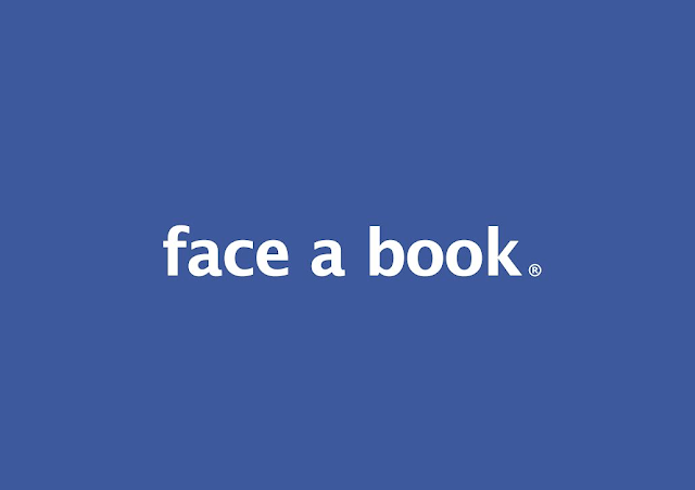
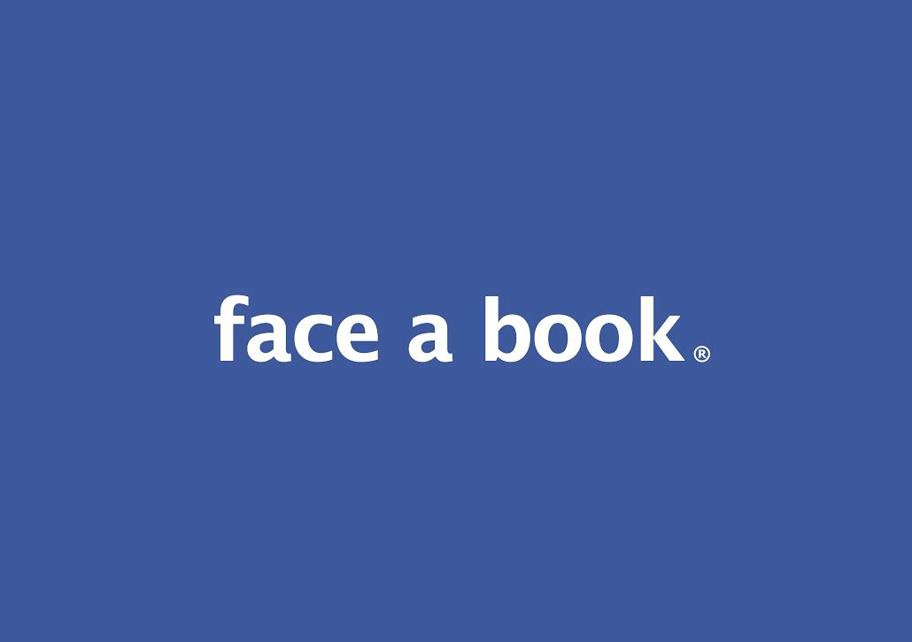
Face a book
My first poster design was extremely simplistic. I started by analysing and picking apart the Facebook logo to see if I could change it slightly. The Facebook font is a custom font created by a font designer named Joe Krall. It appears to have been designed based on the letterforms of Klavika Bold.


I came up with the idea to separate the logo and make the text "Face a book" instead. I decided to do this to create connotations of lack of intelligence by using the site and promote ideologies of education via literature for young children/adults to get off the site and educate themselves. I stubbled to find the font itself, so I created one which was as similar as possible.

The uppercase A seemed too harsh against the existing logo and became the central point to the image which I didn't want.
Final Design
I wanted the poster design to be as similar as the logo as possible so therefore I changed it to lower case and added spaces to make the sentence flow a small r was added on the end to create a final finish identical to the Facebook logo. The poster was landscape as this enabled the logo to be as central to the page as possible to create focus and structure.
Poster 2
Initial Design/Design Choices
Addicted to Facebook
This poster followed poster number one and could potentially be used as a set alongside each other in the various locations, however also worked individually due to its strong imagery. I started by thinking of a few things people can be addicted to, such as alcohol, smoking, drugs etc. I created an illustration of a hand smoking on adobe illustrator and added the f from the Facebook logo. I thought about how I could add the f into the illustration somehow. I slimed the f down to make it as similar to the cigarette as possible.


Next I coloured the design in and made the f into a cigarette shape. To ensure it was more vibrant and eye catching. I created it in a pop art/cartoon style to appeal to a younger audience instead of a hand sketched design.

I then added the famous blue background to make more evident that the cigarette was the f out of the Facebook logo. This design is a direct shocking portrayal that Facebook/social media is an actually an addiction just as much as smoking and that it can have serious negative health effects. This poster used the shockvertising advertising strategy to help young kids understand the serious negative side effects of excessive social media usage.

Poster 3
Initial Design/Design Choices
Feed Your Ego
This poster design was based upon Instagram likes and how gaining more can make you feel better about yourself, which is what young kids are striving to achieve however this also has a negative impact on self-esteem as if an individual doesn't gain as many likes as they wanted it can actually have the complete opposite effect. I came up with the message of "feeding your ego" by putting a picture up that gains likes to create connotations of hunger for acceptance in an increasing self-obsessed and self concious society. I brain stormed a few ideas to communicate this. My first initial idea was to have the Instagram logo with teeth eating likes up however I found it quite challenging to illustrate this so I started to focus on another way to portray this message. I then came up with a cereal box. So I illustrated this using black and yellow to make it vibrant to attract a younger audience again the colour themes throughout the poster adopted this strategy too.

Final Design
I deveopled this further by added a bright orange and a table with a bowl on it branded the "ego" bowl. The cereal box poured out instagram likes. I wanted this poster to make young children/adults be aware that it isn't all about gaining likes and acceptance and that you don't need Instagram likes to make you feel better about yourself. As in reality Instagram likes don't give you the sufficient nutrients and calories to feed your hunger to keep you alive.

Poster 4
Initial Design/Design Choices
Sorry The Lifestyle You Ordered Is Currently Out Of Stock
This poster design was also based around Instagram. I Initially wanted a dull background and an iPhone screen to show how filters make something to appear to be something it isn't. I came across something which inspired me in a great deal. Ironically, it was a Facebook post of a famous super model, Kendal Jenner. The post basically showed the difference between a real life picture and an edited instagram filtered picture. The post stated;
"To any young girl or any woman - please please don't be fooled by a filter. I feel like Instagram can be such a damaging and unrealistic idea of what beauty is and what 'perfection' is. We all have spots and blemishes. No one walks around with a permanent ring light to make you look flawless. Enjoy using makeup but don't ever feel like you have to compare yourself or try be like kenny on the right because she's not reall !! Embrace makeup and wear it for you. Don't wear makeup to look like someone else because realistically they don't look like that ether."

After reading this I came up with a clear concept for this poster. I started by making an illustration of a hand holding an iPhone, similar to poster 2.

Next, I found the typeface that is used for the Instagram logo to make the consumer easily associate the poster to Instagram as quickly as possible. Just in case they didn't i made the screen on the phone look similar to that of the Instagram homepage.
Final Design
I coloured the background brown as it was one of the colours used on the Instagram app logo which would again link the target audience back to the app. The poster attempts to define that Instagram is actually an unrealistic virtual reality where people are able to portray themselves and their lifestyles in the best possible light, with the use of filters etc. I wanted my target audience to understand that none of it is real and it is all based around how people want other people to view other peoples lifestyles not how they actually are.

Poster 5
Initial Design/Design Choices
Technological Relationships
Initial Designs/Design choices
When researching this topic, I looked at quite a lot of Banksy's work as it had the desired effects on the public through strong imagery.

This artwork was named mobile lovers. Banksy shows the common trend in society with smart phones and relationships. Mobile lovers is an extremely popular piece which is ironically received massive exposure on social media.
The story about the peice is pretty interesting as Banksy painted it outside of a boys blub in Bristol and the piece was sold shortly there after. Talk about having a good day when Banksy stops by to drop some work on your front door. The work sold to a private collector for the incredible sum of £403,000. Banksy never seems to amaze, the “Mobile Lovers” work is no different.
The story about the peice is pretty interesting as Banksy painted it outside of a boys blub in Bristol and the piece was sold shortly there after. Talk about having a good day when Banksy stops by to drop some work on your front door. The work sold to a private collector for the incredible sum of £403,000. Banksy never seems to amaze, the “Mobile Lovers” work is no different.

I loved this artwork along with the connotations it bring with it and I attempted to create something similar on illustrator however, it just didn't work as effectively.
Final Design
So therefore I decided to take this image and add a meaningful message overlaid over the top of it.
The message was to make people sound as stupid as possible for using their mobile phones in social situations such as when your with the person you love. Find someone who makes you forget to look at your phone.

Poster 6
Initial Design/Design Choices
Enjoy Your Life/Like
After looking at Bankys work, I wanted to create a similar style design using typography which looked almost graffiti like. I started by finding a wall background and adding text on it to make it look realistic as possible like I had gone and painted it on myself. However, most of the wall backgrounds and the typography choices i used weren't realistic enough.

Final Design
I therefore found a different wall texture to eliminate this. The message was to encourage people to enjoy the life around them instead of constantly having to capture moments on their iPhones to share/please people on social media sites. When intact you can ruin the moment by getting your phone out as you miss it with your own eyes.

Wednesday, 11 May 2016
OUGD505 - Studio Brief 01 - Licence To Print Money
Initial Designs
I wanted my bank note to keep an authentic and royal design but with a unique modern twist, something which enabled it to be completely differentiated from all the other bank notes out there. I started to analyse and brainstorm some ideas that would enable my bank note to be completely unique.

These included;
- Watermark stamp held up to the light to show if the note was real but also included value.
- One Pound notes to make change feel lighter in your pocket and eliminate pound coins out of circulation
- A pure gold sheet £50 note
- Updated £5 notes and £10 notes to match new £20 note design.
- Create a thread that enables the stock to be completely indestructible.
After analysing each point i found that the best solution stated according to a problem I had evaluated was that bank notes can be ruined and aged. I found that english bank notes were able to be completely ripped in half. They can also be folded and scrunched and never retain their original shape.

Instantly the value is lost if it is completely damaged. The notes are also able to burn easily. What if your savings were burnt in a fire? Or your new puppy decided to chew up your wallet.

For this exact reason, is why money is becoming increasingly more electronic than ever that almost more than half of money doesn't actually exist. People believe that electronic money is more safe. I wanted tangible money to be just as safe as electronic money of not more to increase more of it back into circulation. I also wanted to stop forgery of bank notes so it was impossible to create fake bank notes.
Design Choices
1) Ink:
I made a stamp software pen which ran over the lion (Heraldry) on the new design of the bank note, which illuminates if the bank note is real. This is achieved by using a special ink which only note makers own and is very very secure and impossible to get hold of. The pen will be given to individuals of high importance who need to see if bank notes are real such as bankers and shop owners. The lion on my bank note design has been used as lions are commonly associated with fear to symbolise Britain as protected which links back to my concept of keeping these bank notes as safe as possible by using this special ink and pen to eliminate forgery. The lion is common charge in heraldry. It traditionally symbolises bravery, nobility, royalty strength, stateliness, and valour, because historically it has been regarded as the king of beasts which related back to our countries power and status within the world.


2) Stock:
I noticed that bank notes can be damaged easily, specifically ripped in half. I wanted to create a stock that was completely indestructible to being ripped in half. I came up with the idea of using thread to act as an almost fabric like stock but with the use of paper too. The strong thin thread would be cross hatched and then diagonally hatched across. The process is shown below using sketches. If the stock is attempted to be ripped the threads would serve in all angles to prevent this. Two sheets of paper will then be glued over the the cross hatch with the design on each of the pages. Silver would be used for the lower values such as £5 and £10 and then gold for £20 and £50 pound notes as the thin layers of paper with the design on over the top would have small incisions on the left hand side of the design to let the gold or silver thread show throw to create more visual appeal.


Final Design
I decided to screen print my final bank note design using two colours. I designed a £20 pound note design as I researched that this was the most common bank note used as this would enable it to be tested for its durability more accurately.
I researched into some existing bank notes on Pinterest to get some inspiration.


I created the basis of the design using the ink and stock ideas which included the cross catching and the lion which is stated above. The rest of the design I wanted to be timeless and classic and be representative of english culture and and hereditary. The United kingdoms map map was added to celebrate the United kingdoms territory and province. This also enables it to be instantly recognised as a british bank note. I used Monotype Covorsia as the main title "BANK OF ENGLAND" as it was a serif font it creates connotations of sophistication and links back to english literature typography along with tradition and history. It was also used in capitals and at the top of the note to create importance in hierarchy and to ensure it is the first thing that is read as it is the most important piece of information. The same type was used for £20 but was increased in size to also symbolise importance. Twenty Pounds was then stated underneath the Uppercase text in lower case to confirm the value of the note in a scripted sans serif font named Loon Old Style. This typeface was used to compliment the other type and make it visually stimulating and appealing.

I chose the colours purple and gold to promote royal colour connotations as these colours are frequently used in royalty on various garments and even crowns. The purple was also used as it was a £20 pound note and the existing £20 bank note is purple so consumers are able to easily recognise the value without confusion. The same will go for the rest of the note values, £5 green/turquoise and £10 orange etc.
As I had only ever screen printed once before, the process took me a little longer than expected. Screen printing is arguably the most versatile of all printing processes. It can be used to print on a wide variety of substrates, including paper, paperboard, plastics, glass, metals, fabrics, and many other materials. including paper, plastics, glass, metals, nylon and cotton. Some common products from the screen printing industry include posters, labels, decals, signage, and all types of textiles and electronic circuit boards. The advantage of screenprinting over other print processes is that the press can print on substrates of any shape, thickness and size.
A significant characteristic of screen printing is that a greater thickness of the ink can be applied to the substrate than is possible with other printing techniques. This allows for some very interesting effects that are not possible using other printing methods. Because of the simplicity of the application process, a wider range of inks and dyes are available for use in screen printing than for use in any other printing process.
Utilization of screenprinting presses has begun to increase because production rates have improved. This has been a result of the development of the automated and rotary screenprinting press, improved dryers, and U.V. curable ink. The major chemicals used include screen emulsions, inks, and solvents, surfactants, caustics and oxidizers used in screen reclamation. The inks used vary dramatically in their formulations.
Screen Printing Process
Screen printing consists of three elements: the screen which is the image carrier; the squeegee; and ink. The screen printing process uses a porous mesh stretched tightly over a frame made of wood or metal. Proper tension is essential to accurate color registration. The mesh is made of porous fabric or stainless steel mesh. A stencil is produced on the screen either manually or photochemically. The stencil defines the image to be printed in other printing technologies this would be referred to as the image plate.
Screen printing ink is applied to the substrate by placing the screen over the material. Ink with a paint-like consistency is placed onto the top of the screen. Ink is then forced through the fine mesh openings using a squeegee that is drawn across the scree, applying pressure thereby forcing the ink through the open areas of the screen. Ink will pass through only in areas where no stencil is applied, thus forming an image on the printing substrate. The diameter of the threads and the thread count of the mesh will determine how much ink is deposited onto the substrates.
Many factors such as composition, size and form, angle, pressure, and speed of the blade (squeegee) determine the quality of the impression made by the squeegee. At one time most blades were made from rubber which, however, is prone to wear and edge nicks and has a tendency to warp and distort. While blades continue to be made from rubbers such as neoprene, most are now made from polyurethane which can produce as many as 25,000 impressions without significant degradation of the image.
If the item was printed on a manual or automatic screen press the printed product will be placed on a conveyor belt which carries the item into the drying oven or through the UV curing system. Rotary screen presses feed the material through the drying or curing system automatically. Air drying of certain inks, though rare in the industry, is still sometimes utilised.
Screen Preparation
Screen (or image transfer) preparation includes a number of steps. First the customer provides the screen printer with objects, photographs, text, ideas, or concepts of what they wish to have printed. The printer must then transfer a "picture" of the artwork (also called "copy") to be printed into an "image" (a picture on film) which can then be processed and eventually used to prepare the screen stencil.
Once the artwork is transferred to a positive image that will be chemically processed onto the screen fabric (applying the emulsion or stencil) and eventually mounted onto a screen frame that is then attached to the printing press and production begins.
Gold ink Positive

Purple Ink Positive

Although the purple colour came out slightly more pink than expected, overall I was pleased with the outcome.


Subscribe to:
Posts (Atom)