money design and history
‘my
money, my currency’ by hanna von goeler
it is said that recession provokes artists, designers
and alike to create some of their best work but for some
people money is the constant source of question
regardless of the economic climate.
money is many different things at the same time.
it’s a work of art, a medium of exchange, a representation
of value, one, which most people take for granted.
everybody has their own answers when it comes to
money yet we think that it is more generative and
engaging to think about values and doubt.
it is a balancing force.
money creates a mood of euphoria.
money is one of the major constituents in determining
what our lives feel like, what our typical day feels like.
money also represents our society. it’s everywhere
but money is just an idea – an abstract measurement.
 ‘my
‘my
money, my currency’ by hanna von goeler
this is worth…?
it’s rather like the chicken / egg question, there are
phrases that we appropriate, and phrases that
appropriate us. money is paper, money is metal but in
and of itself, it is absolutely worthless. once upon a time,
money
was a little bit more solid an english pound was
just that, a pound of english sterling, whilst a dollar
was a gold coin. but today money is virtual.
the inequities of money. money is dirty. money kills.
it is usually a symbol of power or love, given or withheld.
making money. money seems to go nowhere,
the objective present at money seems missing.
some artists have x-ray eyes and can see through
all of that cloddish substance, which prevents us from
having a clear perception of its ‘physical’ reality -
free from the general claims of ‘economic idealism’.
while others prefer to enhance the surface of banknotes
to cast light over its affects and how it might be perceived.
 ‘my money, my currency’ by hanna von goeler
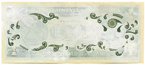 ‘my money, my currency’ by hanna von goeler
 ‘my money, my currency’ by hanna von goeler
‘my money, my currency’ by hanna von goeler
the interstitial quality of money as it travels from
person to person is the point of departure for
hanna von goeler’s ‘my money, my currency’.
in this this ongoing project the artist chronicles
her struggle and relationship with money.
exploring the ethical, political and aesthetic
questions that surround notions of currency.
the title of the project partially references warhol
and walter benjamin with the phrase ‘my money’
but this body of work is not entirely about the
reproduction of money. rather it is about the concept
of currency what it is and who has it.
for the artist currency implies a general acceptance
prevalence and trend. currency is about the exchange
of something whether that be ideas, ethics, culture etc.
‘‘my currency is painting and drawing, my mind, ideas
and spirit. money is what is there, currency is what
I’ve added. drawing and painting money makes us
notice its reproductive quality, as well as providing
a textured way of various roles the object plays.’
‘painting on money also gives me some sense of
power to determine – rather than be controlled by
money’s function within society. this relates to the
concept of agency; it explores the extent of to which
we have the power to define rather than be defined
by the currencies in our culture.’ HVG
to date von goeler has created more than five hundred
one dollar artworks.
 mad art by j.s.g. boggs
 mad art by j.s.g. boggs
mad art by j.s.g. boggs
the american artist j.s.g. boggs refuses to sell his art,
instead he buys things with it. since 1984 he has made
‘mad art’, which resembles currency. he doesn’t try to
pass it off as actual bills, but instead tries to convince
the seller of the piece’s intrinsic worth. due to the
apparent similarities between official currency and
bogg’s creations the american secret service often
seizes his work. there have been several trials brought
against him and he was repeatedly arrested for
counterfeiting both in the US and abroad.
‘once I was an abstract painter, and I wanted to paint
something real, so I started painting numbers. then I
realized that numbers are not real they are total
abstractions. money is also an abstraction; the
transaction makes it real. for example using a
boggs bill to buy a hamburger and receive
in change, in other words what do you think it’s
worth? and then the discussion ensues.’
‘my money looks completely different to ‘real’ money
it is printed on one side and not on two. some are orange,
some are red, some are green and some are yellow.
they have my thumbprint on the back, they have my name
on them – its unmistakably my work. no one would ever
say that it was printed by the government or whoever,
it’s a work of art about money’
j.s.g. boggs
 ‘ten thousand cents’ digital artwork by takashi kawashima and
aaron koblin
 detail of the ‘ten thousand cents’ digital artwork
ten thousand cents digital artwork
by takashi kawashima and aaron koblin
‘ten thousand cents’ is a digital artwork that creates a
representation of a 0 USD bill. the people behind the
project, takashi kawashima and his partner aaron koblin,
divided a 0 USD bank note into 10,000 sections.
next they recruited participants using amazon’s
‘mechanical turk’, to reproduce one of the sections each,
using a custom drawing tool, each participant was
paid 1 cent. after five months of waiting, kawashima
and koblin received all their digital reproductions.
the finished work is presented as a video piece with
all 10,000 parts being drawn simultaneously.
the project explores the circumstances we live in,
a new and uncharted combination of digital labor markets,
‘crowdsourcing,’ ‘virtual economies,’ and digital reproduction.
http://www.tenthousandcents.com
 ‘transparent/ x-ray coins’ by an unknown artist
 ‘transparent/ x-ray coins’ by an unknown artist
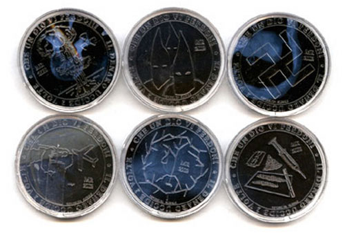 ‘transparent/ x-ray coins’ by an unknown artist
transparent/ x-ray coins by an unknown artist
each coin is made from clear plastic which seals
an x-ray inside. the pieces feature the figure-heads
and tyrants behind human atrocities, ‘evil’ organizations
and world changing events in history: hitler, stalin,
osama bin laden, judas, noreaga and ‘god’ are included.
the value of the coins is relative to the cost each
person had on human life and the suffering they caused.
for example hitler’s is valued at 100 with noreaga
and bin laden worth 50, the klu klux klan is worth 5
and the lowest denomination 1 is god. the text reads:
‘money seriously damages your health’.
the other side of the coin shows a graphic representation
of the persons legacy- for example bin laden’s
coin depicts the twin towers with noreagas’ showing
narcotics and firearms. along with this the text reads:
‘let a god forgive them’ and ‘money kills twice’.
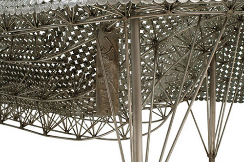 money furniture by johnny swing
money furniture by johnny swing
vermont based designer johnny swing’s nickel couch’
uses 7,000 nickels welded together with 35,000 welds.
the couch is supported with a metal rod base that is
extremely re-enforced. other pieces in the coin series
include an easy chair, side chair and a bowl.
swing also creates other pieces of furniture and
sculptural works.
read more
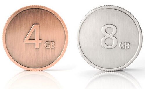 ‘currenkey’ usb flash drive by 5.5 designers for lacie.
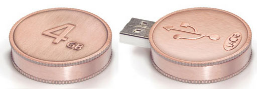 ‘currenkey’ usb flash drive by 5.5 designers for lacie.
‘currenkey’ usb flash drive by 5.5 designers for lacie
‘currenkey’ is a usb flash drive in the shape of a coin.
indicated on the coin’s face is the drive’s storage capacity.
the bronze edition offering 4GB of memory and the silver
having a capacity of 8GB. ‘currenkey’ is meant to be a
reflection on the value which we grant our data and the
price we pay in order to store it safely in the IT capital.
read
more
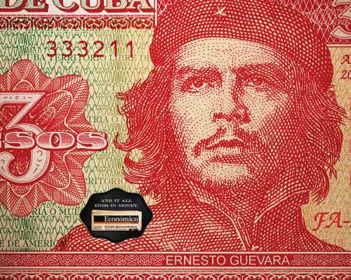
 advertising campaign fischer portugal, lisbon for ‘económico’
business newspaper the tiny slogan read’s ‘and it all ends in
money’.
there are close to 200 countries in the world and almost
as many recognized currencies in use. each one of these
currencies is highly symbolic, tells stories and is a graphical
representation for entire countries and regions of the world.
as such its design is of great importance. in this article we
look at how money developed, how it is made today and
some of the design considerations.
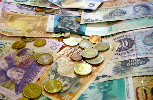 a collection of coins and banknotes from all over the world (photo via flickr)
history
the sumerians and the babylonians were among the first
to develop the practice of trading currency, however
bartering valuable goods in exchange for others has
existed even longer. the earliest example of goods
trading dates back over 100,000 years in swaziland,
where red ochre was exchanged. other currency
stand-ins included barley, precious metals like gold
and silver as well as foods and spirits.
coinage
because bartering wasn’t standardized, it was quite complicated.
standardized coinage soon took over allowing people to exchange
goods for money instead of other goods. gold and silver blocks
were among the first units of coinage. coinage was later reduced
in size, more closely resembling what we know as coins today.
the touchstone was a key driver of this new coin economy, as it
allowed users to determine the value of the coins by rubbing them
on the stone. these primitive coins were made from metals and were
crafted with designs to represent their origin. their value was in direct
proportion
to their weight. by pre-weighing coins and
having them minted by governments, touchstones
became unnecessary and users relied on the graphic
design to calculate value.
paper money
paper money followed a similar trajectory as coinage.
warehouses
storing goods for people issued receipts
signifying the rights
to the stored goods. people would
trade these receipts, transferring the goods through
the form of paper. this system slowly evolved and
transformed into representative currency. the term
representative
currency is used to describe this type of
money because paper money didn’t have intrinsic value
like precious coins, thus paper money only represented
value but didn’t hold it. this represented a major
psychological shift in the use of money. despite not
having intrinsic value, paper money was backed up
with valuable goods like gold.
banknotes to today
while the first examples of representational money were
from warehouses, goldsmiths and banks also developed
similar systems
that lead to the development of banknotes.
this form of money was issued by banks and could be converted
into an equal value of gold or silver. however this form of currency
relied on the banks themselves. this system had some faults and thus
slowly evolved
into fiat money, which is issued by governments
and isn’t backed up by anything. this is the system
currently used by all of the major currencies in the
world today.
currency design
throughout its many evolutions, money has been
designed using the latest technologies, whether they
be metal forming techniques for coins or printing methods
for paper banknotes. designers and artists have played
a key role in giving form to currency since its inception.
currency
design is a small industry and most practitioners
are either graphic designers or highly specialized
craftspeople who are well trained in the process of
making money.
 1,000 francs from the central african republic issued in 1990 (via banknoteworld)
manufacturing
paper banknotes and metal coins have very different
manufacturing
processes that are both highly intricate
and become more advanced with every issue.
banknotes are primarily printed on special paper
commonly made with cotton fibres using a process
known as intaglio. this printing process was originally
developed
in the 15th century and is used on most
currencies in the world. to print a banknote using intaglio,
the reverse image is incised onto a metal plate, which is
usually
made of zinc or copper. ink is applied to the plate
and then the excess is wiped off leaving ink in the
negative form. the paper is laid on top and compressed
against the plate. the ink from the negative space has
been transferred to the paper and the resulting image
reveals the positive. this process is then repeated if
there are more than a single colour involved.
while intaglio is the most common currency printing
process, new polymer based banknotes have begun
to gain traction in some countries, allowing a variety of
other printing alternatives. polymer banknotes are more durable
than their paper counterparts and can be printed
using intaglio, offset printing, silkscreening or letterpress.
as of 2008, only six countries have switched their
currency to all polymer banknotes while a number of
others are testing the new material.
coins on the other hand are made from a variety of
metals and alloys with the most common being zinc,
copper and nickel. these metals are rolled out and turned
into large metal sheets that are then pressed to remove
the blank coins. these blank coins are softened by
annealing them in a furnace and then cleaned. once clean,
the coins are put through the edge-rolling process that
applies the pattern on the edge of the coin. once rolled,
the coins move onto the coinage presses that emboss
the front and back designs into the coins using incised
plates similar to those used to print banknotes.
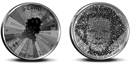 commemorative five euro coin for dutch architecture by stani michiels (via infoaesthetics)
form
money has come in many shapes and sizes over its long history,
however almost all contemporary currency uses
a similar format and overall design. the size of most
banknotes and coins are very similar. banknotes are
primarily printed in a landscape format on both sides
using a single colour or a combination of a few. they are
mostly made with a 2:1 ratio of length to height and
measure on average 15cm long. each bill is printed
with is country of origin, value and date of issue.
depending on the design and country, the bill may also
show other information. they are commonly issued in
a number of higher value denominations, which are
differentiated
by colour, shape and pattern or design.
banknotes also feature
a number of security features
like hologram stickers or special colour changing inks.
coinages of different currencies also share many
similarities. coins are typically very small with the biggest
being no more than a few centimetres in diameter.
some are a single colour ,while others combine two or
more pieces to create more intricate patterns and
designs. coins are issued in a number of smaller denominations
and are differentiated by size, shape,texture and their visual design.
their embossed patterns depict images and text and in most cases
can be differentiated by the visually impaired.
 500 kronur from the faeroe islands issued in 2004 (via banknoteworld)
subjects
as mentioned in the form of money, most coins and
banknotes features a variety of subjects in addition to
the country of origin, value and date of issue.
although every currency is different, there are a number
of common subjects that are depicted on money.
portraits of politicians, members of royalty and cultural
figures are perhaps the most iconic and common subject
matter
depicted on money. animals, plants, buildings,
landmarks and landscapes
are some of the other
examples. cultural scenes and themes are popular
images in contemporary currency.
joining these images and objects are different designs
and patterns that serve to accent the main focus and
protect it from counterfeiting. these patterns are often
inspired by motifs found in the currency’s culture of origin
or based on historical patterns taken from calligraphy
or art.

‘the royal shield of arms’ new UK coinage by matthew dent (more info)
security
security has always been a key part of currency and
money design. with new technology and printing
techniques, today’s banknotes and coins are the most
sophisticated
ever produced. because coins are
normally used for small denominations, less priority is
given to them in terms of security. banknotes, on the
other hand, are carefully protected especially the most
common
denominations.
the paper used is one of the primary anti-counterfeiting
measures.
most money is printed using a heavy paper
made with fibres that can be cotton, linen or specialty
colour fibres. polymer bills offer a more durable solution
and can be made with small transparencies that are
hard to counterfeit. the printing process also adds
security, for one the intaglio process is very difficult
to reproduce.
patterns that are difficult to reproduce are
also used to add security, as are watermarks,
fluorescent dyes and micro printing. the ink itself is also
another
area of printing security. in additional to standard
inks, intaglio printing can be done using colour changing
inks, magnetic inks and thermochromatic ink. holograms
that are applied to bills can also help protect them and
are a specialized material hard to copy. while these
security features do not guarantee protection
individually, combining them in intricate ways keeps
counterfeiters
at bay.
 25 gulden from suriname issued in 2000 (via bank-note)